
NEW

RANGE

DESIGN

NEW

RANGE

DESIGN

LAVAZZA STEPS INTO THE FRIDGE

The idea that worked

For the launch of its new line of cold ready-to-drink beverages, Lavazza needed to win over a younger audience without losing its identity. We built a design able to hold together two seemingly distant souls: pure indulgence, an essential element in this product category, and the authenticity of Italian coffee, always the brand's true heritage.

Client

Lavazza

Project

Brand Design

Actions

Visual Identity 
Packaging Design

On air

THE WATCHWORD: SHELF CLARITY

A pack designed to be recognised in an instant

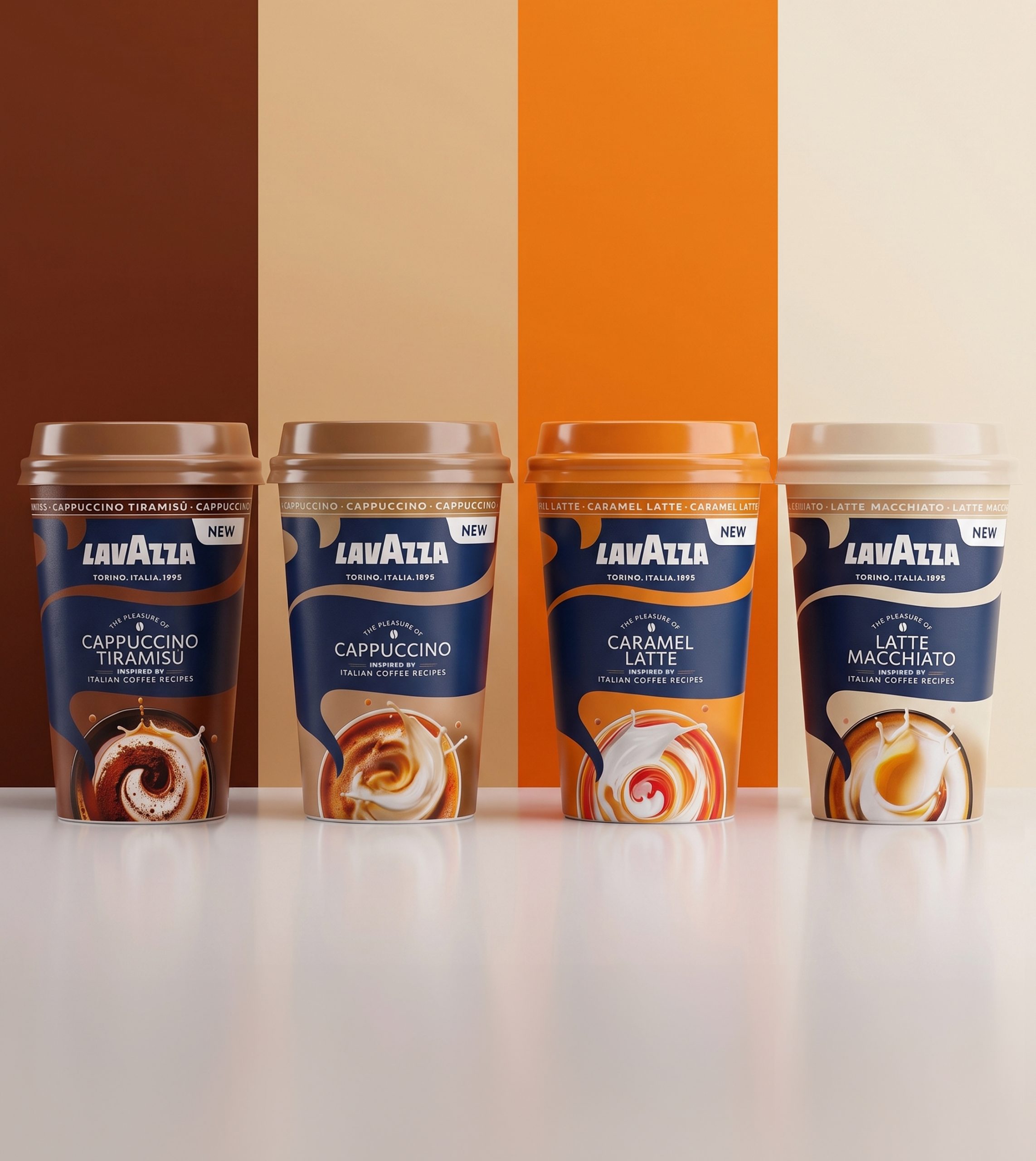
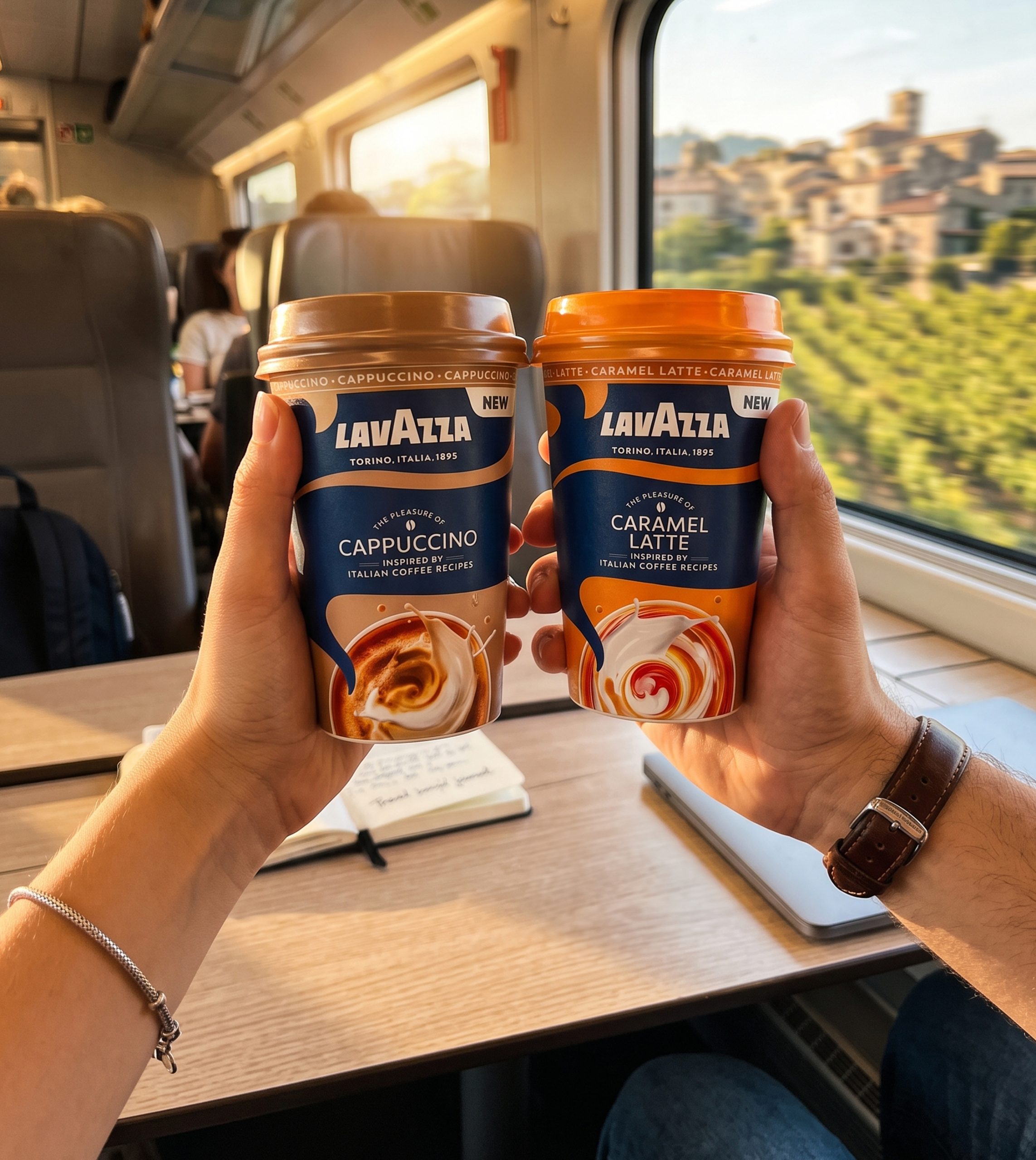
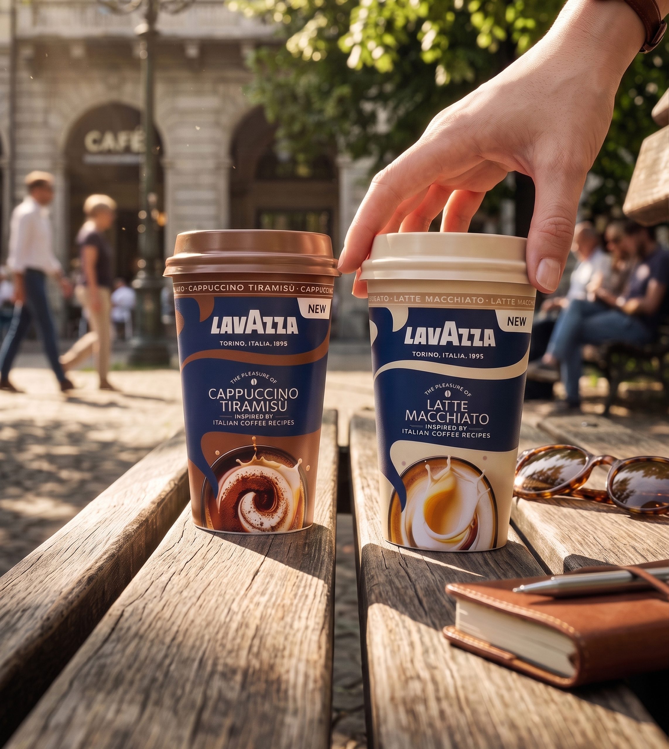
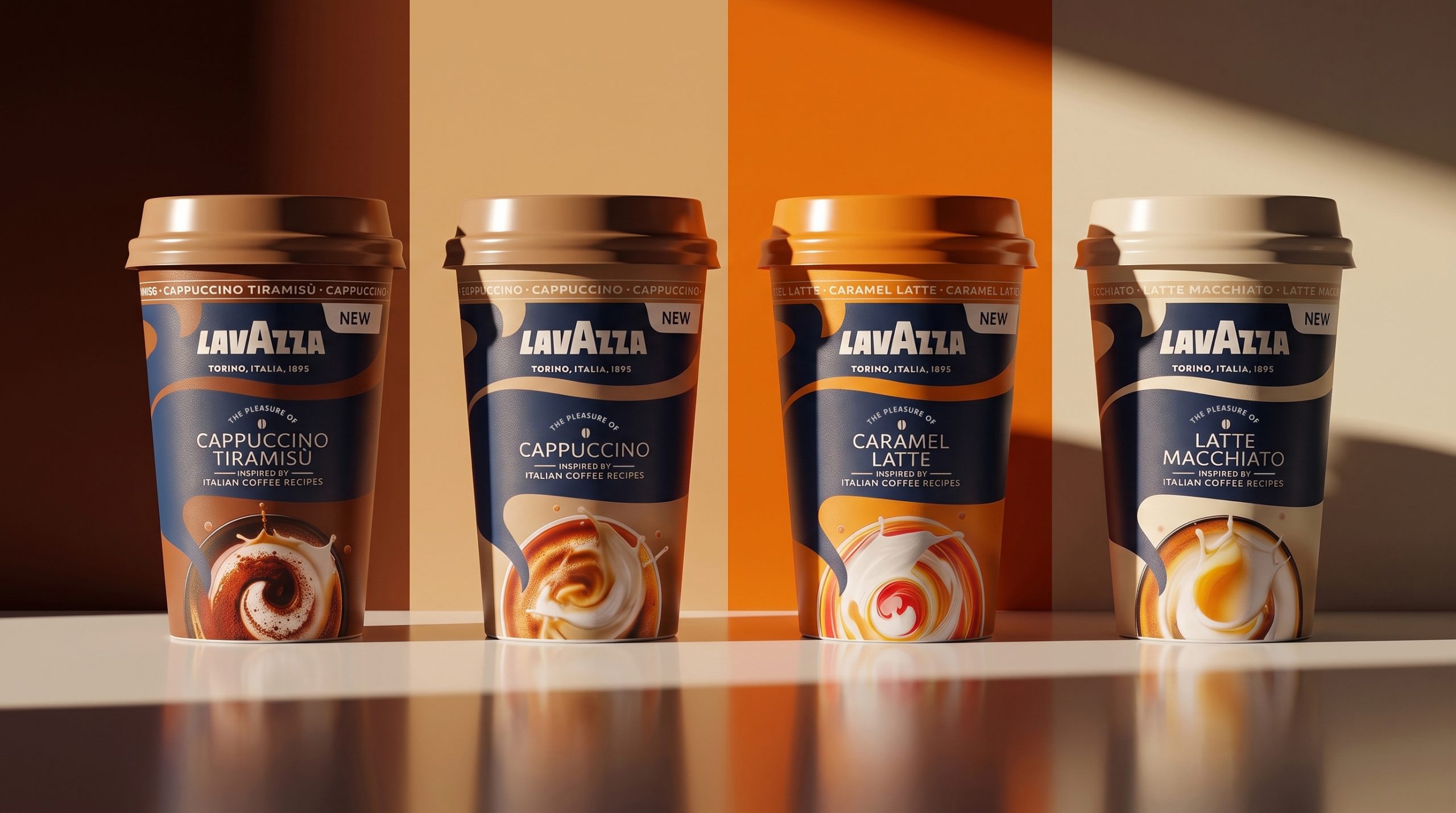
Cappuccino, Latte Macchiato, Cappuccino Tiramisù and Caramel Latte come to life in a visual identity that communicates brand and flavour in a split second: a dedicated colour code for every variant, the Lavazza logo always centre stage, the indulgent image of the drink front and centre. The same balance runs through the copy: the payoff "The pleasure of..." tells the story of indulgence, while the claim "Inspired by Italian Coffee Recipes" grounds every variant in Italian authenticity.

WANT TO BRING YOUR PROJECTS TO LIFE?

Text us. We’ll bring your ideas to life!

Wave Go Green calculated and compensated this website’s CO2 emissions.
crosschevron-down