Mareblu

NEW

Visual Identity

Mareblu

NEW

Visual Identity

A RESTYLING BETWEEN HERITAGE AND MODERNITY

The project

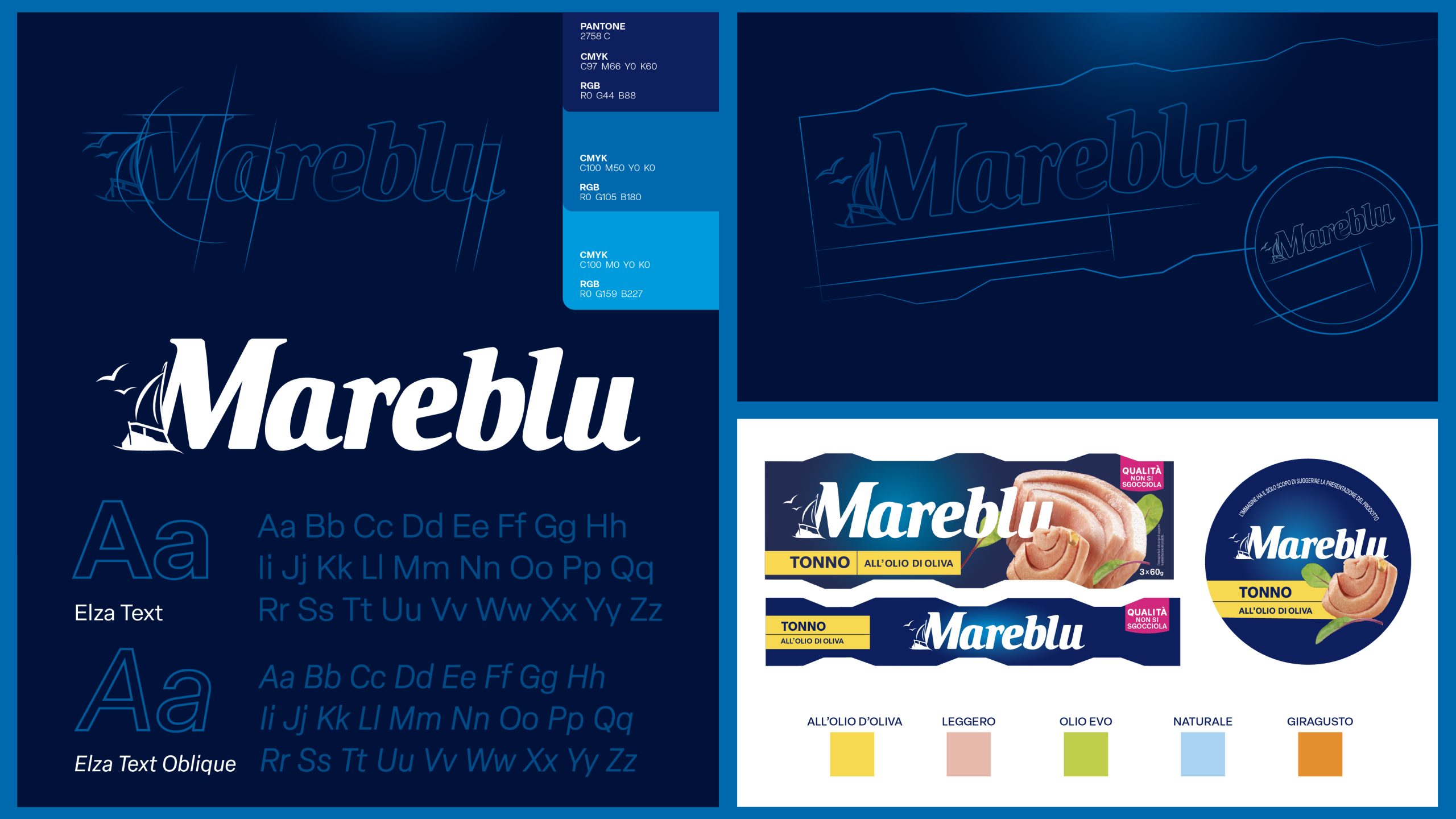
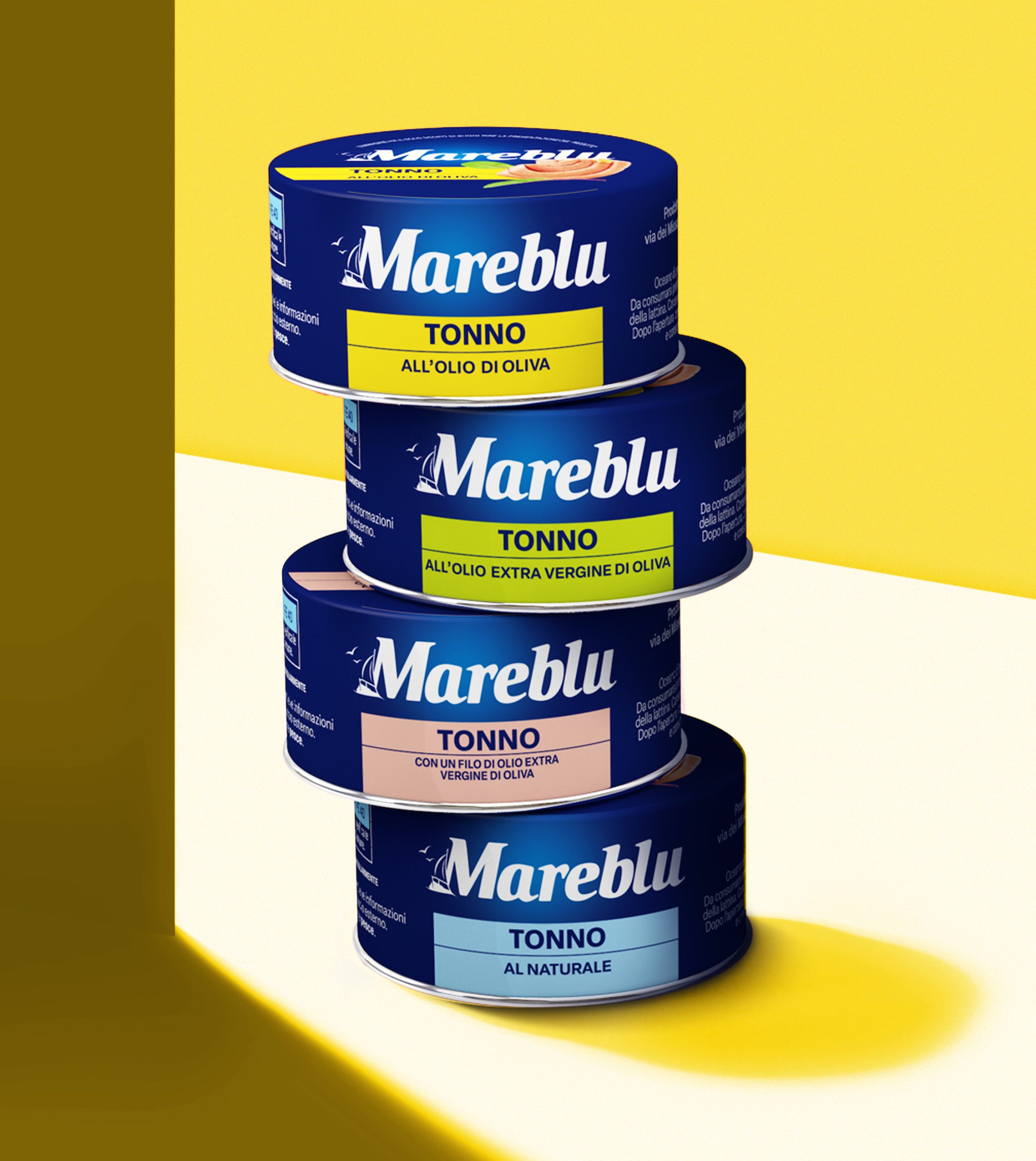
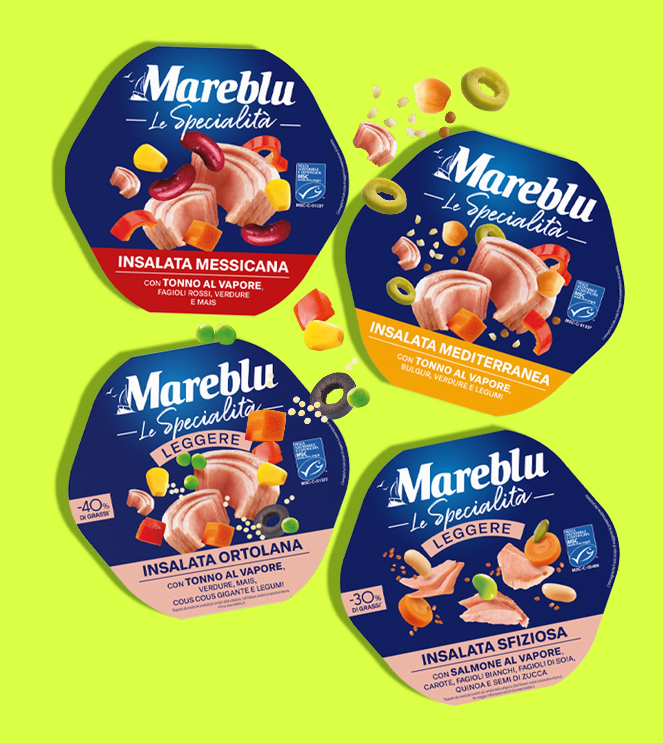
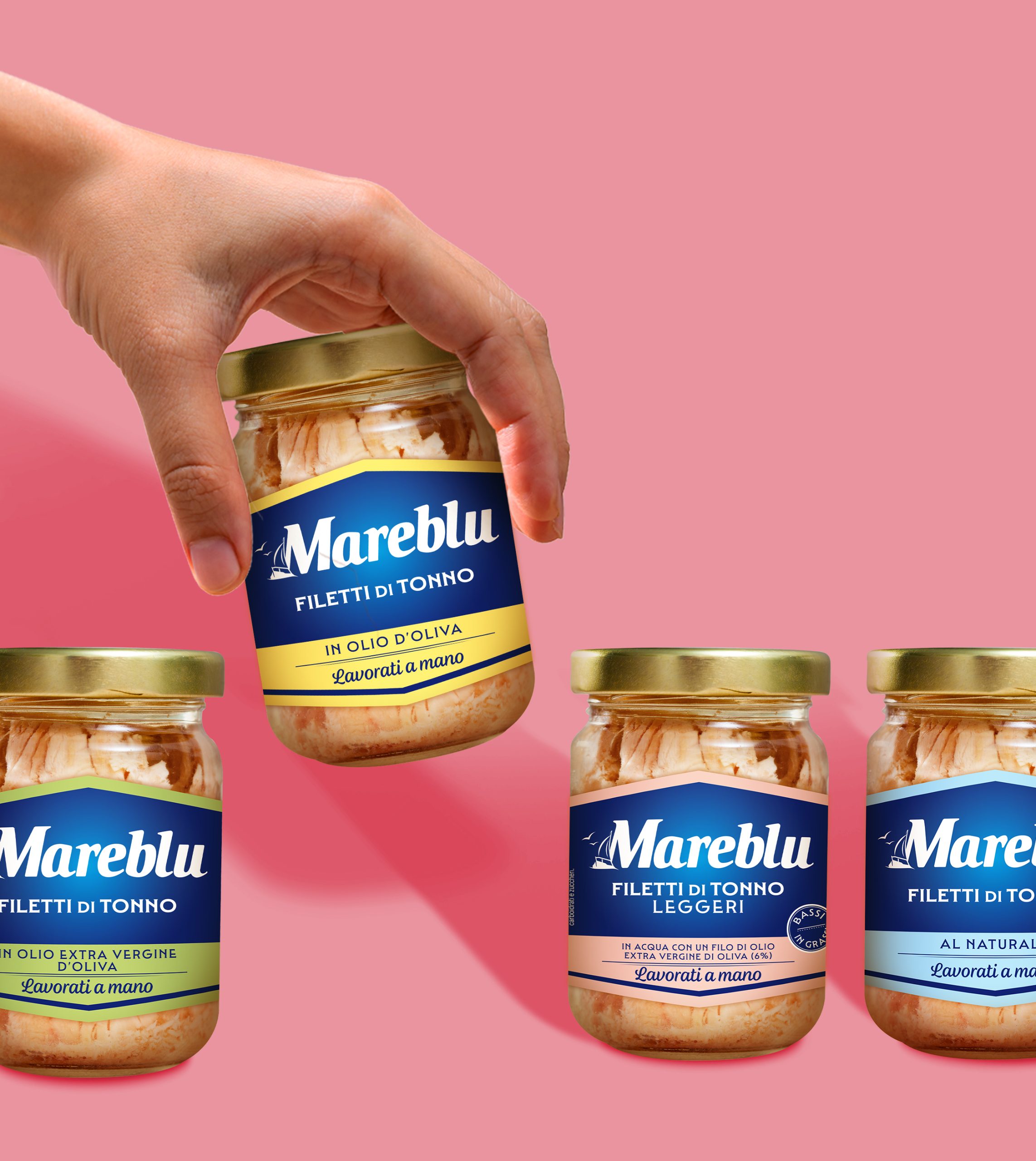
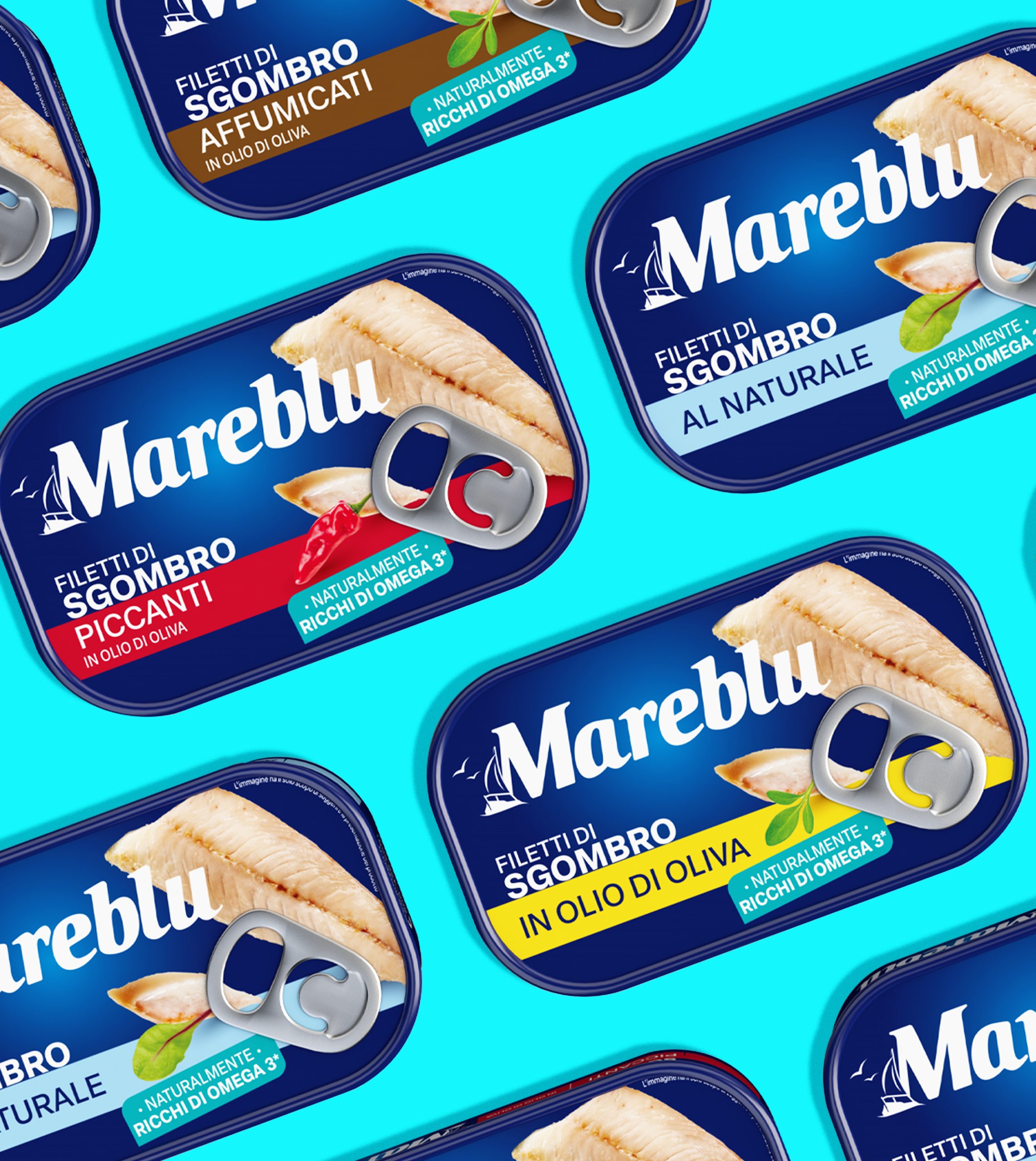
We supported Mareblu in the conception and development of its new visual identity. The process started with strategic analysis workshops that assessed the brand’s strengths and weaknesses and outlined its future development. The approach aimed to modernise Mareblu as a consolidated and recognisable “one brand”, while maintaining its core values and distinctive features.

Client

Mareblu

Project

Brand Design 

Actions

Visual Identity 

On air

2025

THE NEW FACE OF THE SEA

A new look for the brand’s icons

The sea, a fundamental symbolic element for Mareblu, has been given a modern twist and runs as a common thread throughout a coherent visual system across the entire product range. The new logo has been designed using a clean, authoritative font and incorporates the iconic sailing ship within the letter 'M'. The blue colour has been enhanced with highlights and depth to emphasise the visual impact, and the design has been given a dynamic, high-quality look to convey the taste and freshness of the product.

A COLOUR BLOCK THAT STANDS OUT ON THE SHELF

A unique graphic system applied across all ranges

The new visual identity is both orderly and impactful. Distinct product lines are identified by clear, yet subtle colour differences. Each range, from tuna in olive oil to salads and fillets, is presented within a clear, simple visual structure that makes it easier for consumers to identify and enhances their experience at the point of sale.

WANT TO BRING YOUR PROJECTS TO LIFE?

Text us. We’ll bring your ideas to life!

Wave Go Green calculated and compensated this website’s CO2 emissions.
crosschevron-down