KINDER

KORNETTI

KINDER

KORNETTI

A UNIQUE PRODUCT OF ITS KIND

The project

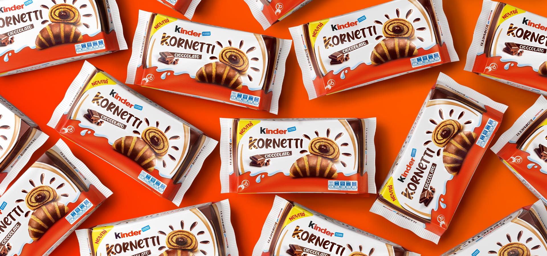
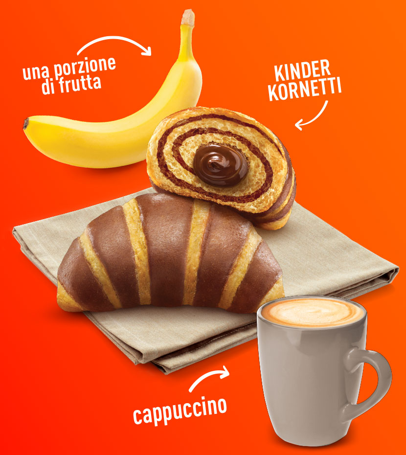
Kinder Kornetti is not just the first croissant by Ferrero, but also the first industrial product with two-tone dough. In the same way, the visual identity system and the logo we studied best express the uniqueness of the product even on the shelf, without ignoring the cheerfulness and lightness that have always distinguished the brand.

Client

Kinder

Project

Brand Design

Actions

Visual Identity

On air

2022

PLAYFULLNESS AND MORE

A treatment that meets the tastes of a new target

The brand design meets Kinder’s needs to strengthen its presence at breakfast time and address to a wider public, intercepting not only families with children, but also a target of young adults. The result is a graphic system with a playful look and feel and a strong visual impact, designed to enhance the most representative trait of the product: the two-tone dough.

A WHIRLPOOL OF TASTE

A product peculiarity to be enhanced in every element

The streaks, in addition to being the protagonists of the logo, have also become an easily recognizable element on the front and sides of the package, for a perfectly coherent and distinctive communication architecture.

WANT TO BRING YOUR PROJECTS TO LIFE?

Get in touch. We'll make your ideas happen.

Wave Go Green calculated and compensated this website’s CO2 emissions.
©Wave 2021
crossmenuchevron-down