KINDER

KORNETTI 

PACK RESTYLING 

KINDER

KORNETTI 

PACK RESTYLING 

NEW RECIPE, NEW DESIGN

The project

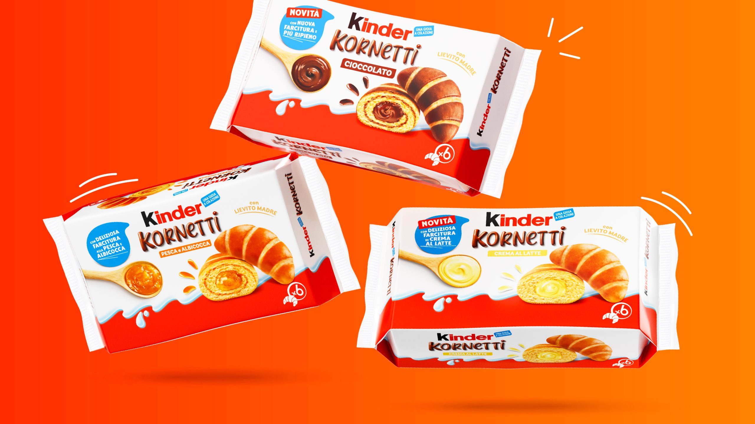
Three years after its market launch, Ferrero decided to revamp the visual identity of the Kinder Kornetti product — previously developed by Wave in 2022 — with the aim of highlighting the recipe change, namely the new and increased filling, while reducing the visibility of the two-tone dough detail, which consumers considered not enough relevant.

Client

Ferrero

Project

Brand Design 

Actions

Visual Identity 

On air

Since 2025

CLEANER DESIGN, WITH MORE FOCUS ON THE PRODUCT

Towards a more adult positioning

The restyling focused on highlighting the taste and indulgence of the product, with greater visibility given to the packshot showing the product cut in half and the introduction of the cream spoon graphic device. The logo was also revised to give it a creamy effect. All of this was accompanied by greater minimalism to position the product as one for adults. This approach was applied to all three product variants, including the launch of the new milk cream flavour.

WANT TO BRING YOUR PROJECTS TO LIFE?

Text us. We’ll bring your ideas to life!

Wave Go Green calculated and compensated this website’s CO2 emissions.
crosschevron-down