LEMONSODA ENERGY

PACK RESTYLING

LEMONSODA ENERGY

PACK RESTYLING

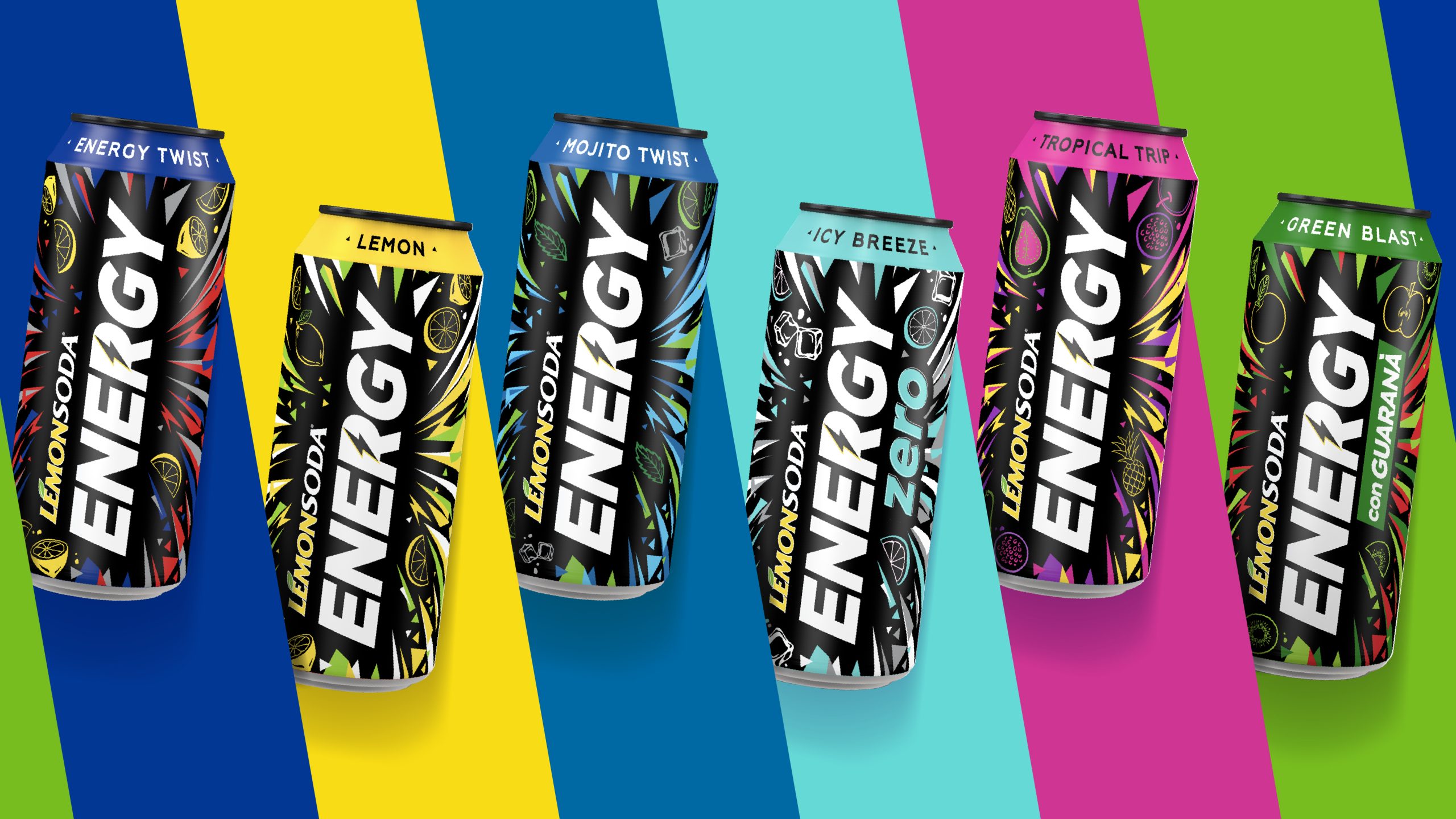
A FRESH VISUAL CHARGE

The project

Lemonsoda entrusted us with the restyling of its Energy line with a clear objective: to make it more competitive in the energy drink segment by modernizing its visual identity and appealing to a young, urban, and dynamic target.

Client

Lemonsoda

Project

Brand Design

Actions

Visual Identity 
Packaging Design

On air

2024

BOLD AND CONTEMPORARY STYLE

An unconventional alternative in the world of energy drinks

We developed a new, cooler design that stands out on the shelf while preserving the brand’s original identity. The logo was rotated vertically to maximize visibility and convey strength and personality. The graphic pattern was refreshed with a more current look, and the overall visual system was streamlined and simplified to clearly communicate both the product type and its flavor. The result is a high-impact, bold, and instantly recognizable look that stands out among competitors.

WANT TO BRING YOUR PROJECTS TO LIFE?

Text us. We’ll bring your ideas to life!

Wave Go Green calculated and compensated this website’s CO2 emissions.
crosschevron-down