
PACK

RESTYLING 

PACK

RESTYLING 

THE SAME SORBET. A NEW WAY TO TELL ITS STORY.

The idea that worked

To reach a wider audience and speak to a younger target, Sorbissimo needed to evolve without losing what makes it recognisable. We chose not to touch the substance — the same taste, the same creaminess, the same love for sorbet we've always had — and to renew only the way we tell that story: with a fresher, more contemporary language.

Client

Sorbissimo

Project

Brand Design

Actions

Visual Identity 
Packaging Design 
Social Video

On air

A CLEANER, MORE CONTEMPORARY PACK

A restyling that enhances rather than overturns

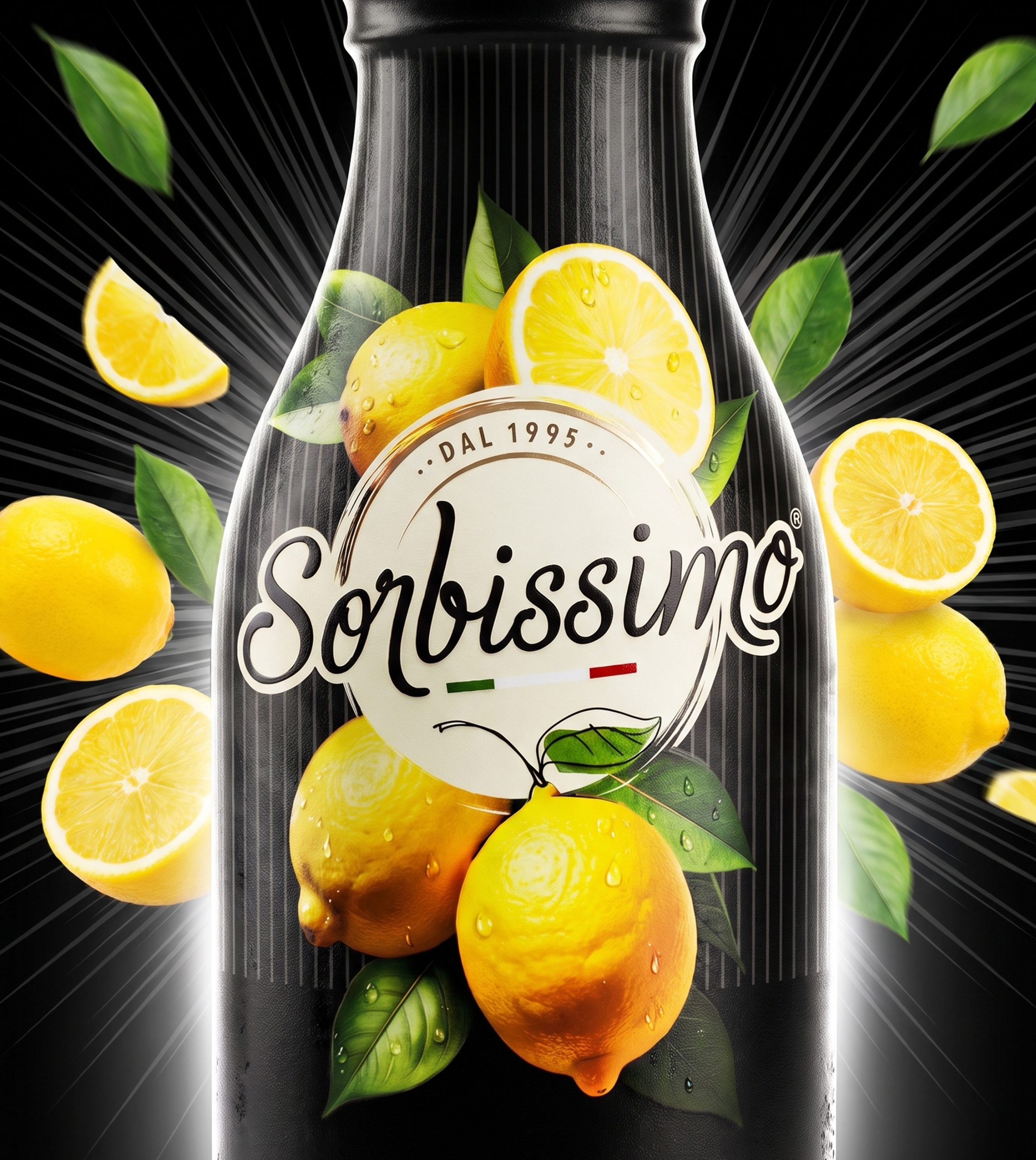
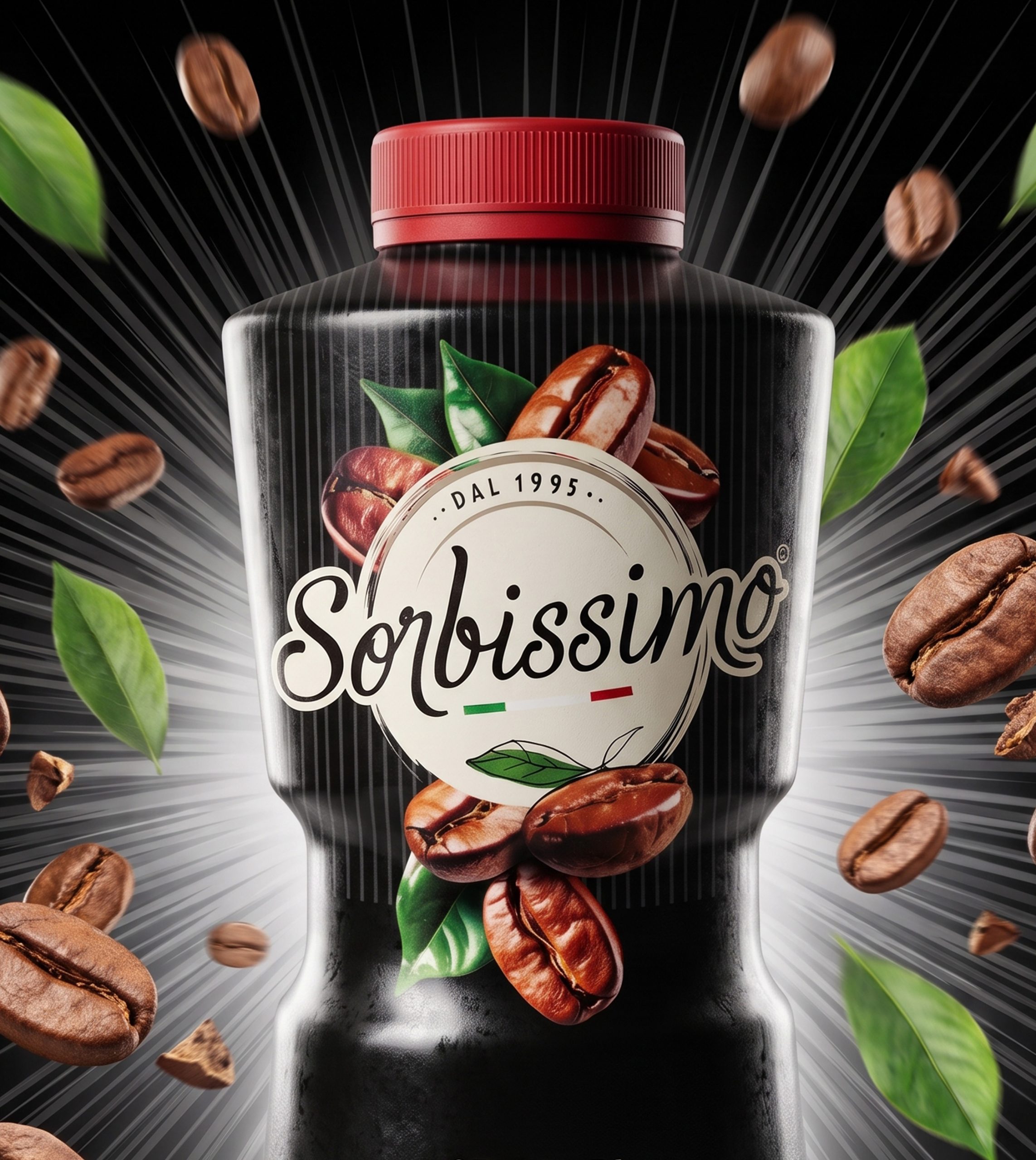
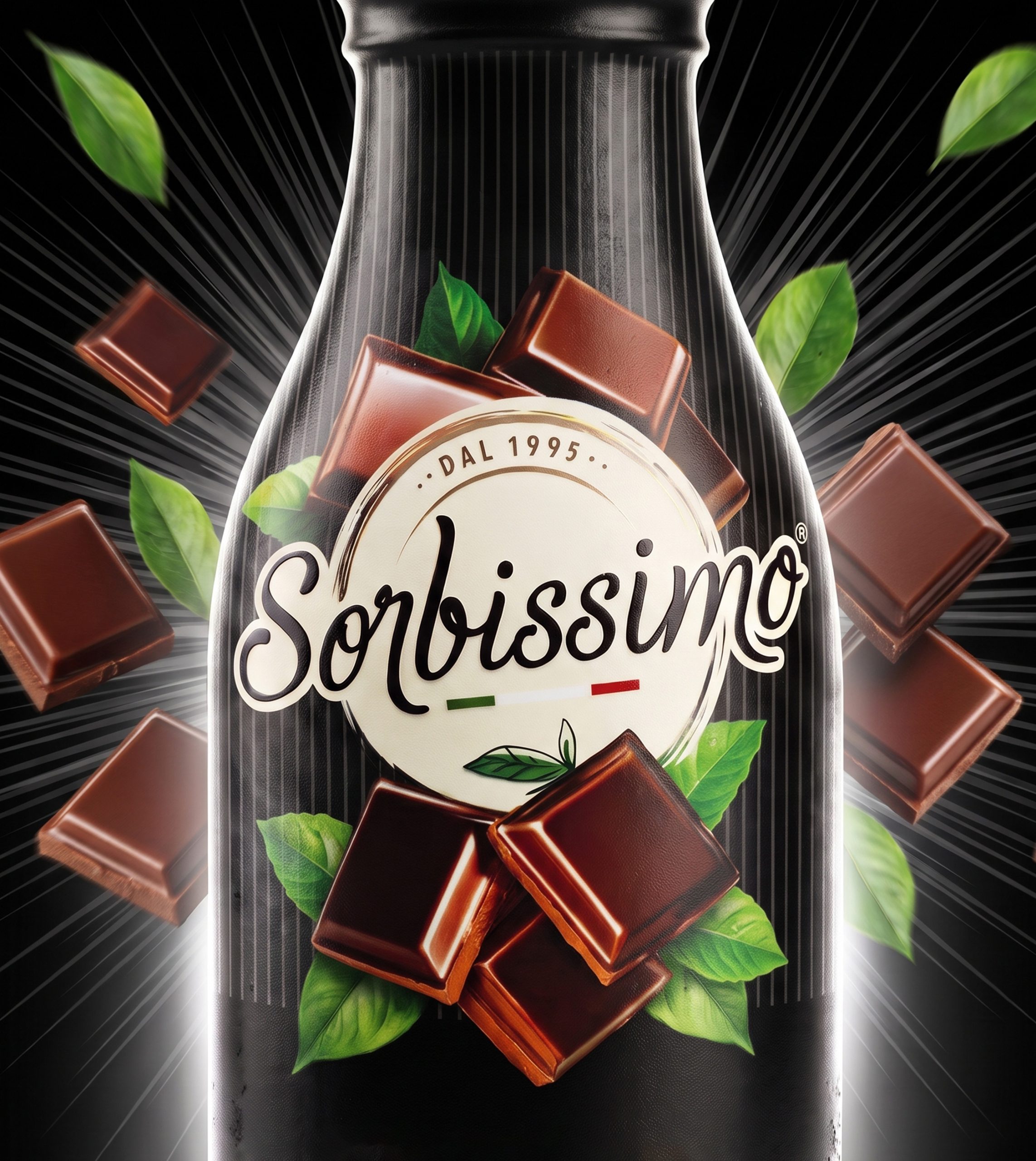
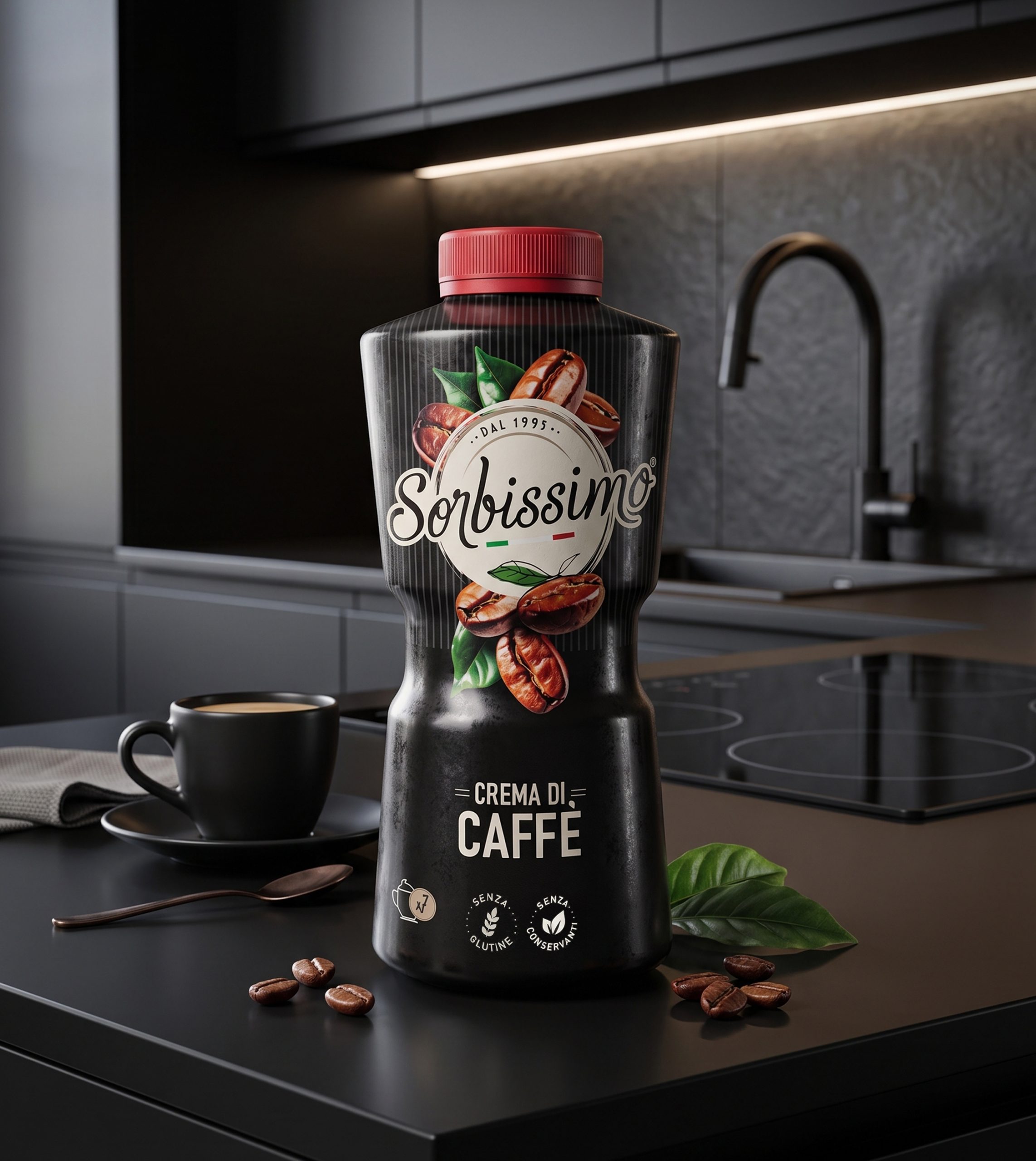
We chose not to start from scratch: black, vertical stripes, the logo and the ingredients remain the same elements as always, now with a fresher, more modern visual rendering. Chocolate, coffee and Sicilian lemon become the absolute protagonists of the label, with photorealistic illustrations that "explode" onto the pack instead of staying confined to small decorative details. The layout becomes lighter, information is reorganised with clearer hierarchy, and the result is a more modern, more immediate design that keeps the brand's recognisability fully intact.

THE SOCIAL LAUNCH

A video that tells a brand new story

The launch of the new pack is entrusted to a video with an elegant, engaging tone, holding together the project's three key messages: the brand's heritage, the pack restyling and the quality of the taste. The closing line plays on the concept of "finale", tying it to the very nature of the brand: "the finale every moment deserves."

WANT TO BRING YOUR PROJECTS TO LIFE?

Text us. We’ll bring your ideas to life!

Name
Privacy
Wave Go Green calculated and compensated this website’s CO2 emissions.
crosschevron-down